Los columnistas de Visualmente::Carlos Gámez Kindelán::Rodrigo Sánchez::Jordi Catalá::Mario Tascón::Samuel Granados::Dolores Pujol::Fabio Marra::Luiz Adolfo::Leo Tavejnhansky::Massimo Gentile::Pablo Corral::Angel Casaña::Pedro Pérez Cuadrado::Tomás Ondarra::Kohji Shiiki::Elio Leturia::Rodrigo Fino::Ramiro Alonso::Sergio Fernández::Lo más leído de Visualmente::Portadas::Infofreak::Fotografía::Especial Helvética::Especial: Frases del 2008::Especial Cooper Black::Creatividad::Caricaturas::Cuartas Jornadas::Cumbre Mundial::Desnudos::Diarios impresos::Diarios online::Diálogos Visuales
Nuestros Blogs Asociados::Visualmente::Indio::Infograkids::Infografreaks::Infografreaks-edu::Mala Magazine::Bar Visual::Tipográficamente::Chillart::Universitariamente::Visualmente-Edu::Vía Libre::Bar Uch::Que Bien Que La Estamos Pasando::Twittermente::Seguinos en Twitter::Las editoras de Mala::Cristina Poetto::Miru Trigo::Ivonne Caamaño::Ana Ottone::Evita Las Tentaciones::Gaba Urco::Nacha La Macha::Beta Ramírez Bustelo::Carolina Ramírez::Connie Moreno::Juana Medina::Yanina Isabella Tejera::Anna Marti::Lina Delgado Cortés::Sofi Ginestra::India Herrera::La Bender Baruch::Los editores de Chillart::Martín Pons::Pinguboy::Raúl Manrupe::Elio Leturia::Les Cuevas Otonelli::Nathalie Sonne::Germán Kemerer::Lucas Groglio::Rodolfo Fernández Alvarez::Raúl Della Valle::Julio Cuervo::Javier Cuello::Julián Chappa::Fabián Carreras::Jenny Canales Peña::Gastón Caba::Pablo Bobadilla::Federico Fuertes Guzmán::Bender Baruch::Seguinos en Twittermente

2.7.07

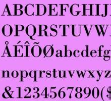
Daniel Marsula por la Bauer Bodoni

marsula1
(Daniel Marsula, director de arte del diario norteamericano Pittsburgh Post-Gazette)
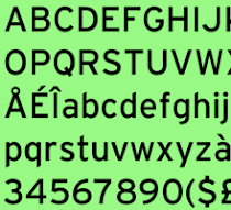
Here at the Pittsburgh Post-Gazette we use two Font families. The first font is a San-serif, ITC Franklin Gothic, (Book, Demi and Heavy. Which varies from regular, condensed, compressed and extra compressed). The second font is a serif, Bauer Bodoni (Roman and Condensed). We use combinations of these two fonts throughout the paper for consistency as do most newspapers.
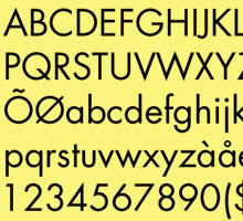
The Weekend Magazine is one of the sections that allows me to break the type style rules when it seems appropriate. But in most cases I prefer Franklin it tends to meet most of my needs, The variations of type styles gives me a wider range of styles to design with. The only thing about Franklin is that it does not have a light face font. When creating a large headline in Book it seems to heavy. But in that case I cheat sometimes and use Futura Light and adapt it a bit to look like Franklin.

No hay comentarios:

Publicar un comentario

Polaroids visuales

las nuevas: ren & stimpy

las nuevas: anna

OPINIONES SOBRE LA BODONI

SOBRE LA NIMROD

SOBRE LA MYRIAD

SOBRE LA FUTURA

LAS NUEVAS: MOD

LAS NUEVAS: NEW DEAL

LAS ODIADAS: COMIC SANS

Nuestras categorías