Los columnistas de Visualmente::Carlos Gámez Kindelán::Rodrigo Sánchez::Jordi Catalá::Mario Tascón::Samuel Granados::Dolores Pujol::Fabio Marra::Luiz Adolfo::Leo Tavejnhansky::Massimo Gentile::Pablo Corral::Angel Casaña::Pedro Pérez Cuadrado::Tomás Ondarra::Kohji Shiiki::Elio Leturia::Rodrigo Fino::Ramiro Alonso::Sergio Fernández::Lo más leído de Visualmente::Portadas::Infofreak::Fotografía::Especial Helvética::Especial: Frases del 2008::Especial Cooper Black::Creatividad::Caricaturas::Cuartas Jornadas::Cumbre Mundial::Desnudos::Diarios impresos::Diarios online::Diálogos Visuales
Nuestros Blogs Asociados::Visualmente::Indio::Infograkids::Infografreaks::Infografreaks-edu::Mala Magazine::Bar Visual::Tipográficamente::Chillart::Universitariamente::Visualmente-Edu::Vía Libre::Bar Uch::Que Bien Que La Estamos Pasando::Twittermente::Seguinos en Twitter::Las editoras de Mala::Cristina Poetto::Miru Trigo::Ivonne Caamaño::Ana Ottone::Evita Las Tentaciones::Gaba Urco::Nacha La Macha::Beta Ramírez Bustelo::Carolina Ramírez::Connie Moreno::Juana Medina::Yanina Isabella Tejera::Anna Marti::Lina Delgado Cortés::Sofi Ginestra::India Herrera::La Bender Baruch::Los editores de Chillart::Martín Pons::Pinguboy::Raúl Manrupe::Elio Leturia::Les Cuevas Otonelli::Nathalie Sonne::Germán Kemerer::Lucas Groglio::Rodolfo Fernández Alvarez::Raúl Della Valle::Julio Cuervo::Javier Cuello::Julián Chappa::Fabián Carreras::Jenny Canales Peña::Gastón Caba::Pablo Bobadilla::Federico Fuertes Guzmán::Bender Baruch::Seguinos en Twittermente

29.3.08

Marian Bantjes por la Absara

marian
(Marian Bantjes, tipógrafa y calígrafa canadiense)
1) Do you use frequently? (Why?)

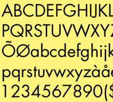
I use Absara (by Xavier Dupré) a lot, though mostly for my own materials. (I don't typeset things much any more.) I fell in love with Absara in 2004 when I did a piece for FontShop (Font 004) and used Absara in it. It is so beautiful, especially the italic (and I was amazed how well the italic set on a curve!). So after that I bought it, and as I have made it my default font in InDesign, I use it every day.

2) prefer? (Why?)

Currently I am in LOVE with Jonathan Hoefler's Knox and Acropolis ... *especially* the Acropolis Black Italic. It is stunning, and so fun to work with. The angles make for incredible satisfaction when fitting text together. You have those moments of perfect, beautiful, logical alignment over and over again.

I am also a long-time fan of Frantizek Storm's typefaces, and Cobra is one of my favourites. Storm's type is always a little quirky and strange, which I really like.

3) He hates? (Why?)

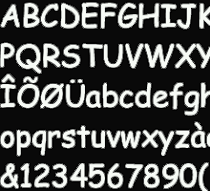
I hate Myriad. It is so sexless. Individually, the letterforms are not objectionable, but everything set in Myriad looks like a humourless schoolmarm ... or a pasty schoolmaster; it's hard to say which. Myriad is neither here nor there, it has neither joy nor conviction, it is nothingness in a typeface.

No hay comentarios:

Publicar un comentario

Polaroids visuales

las nuevas: ren & stimpy

las nuevas: anna

OPINIONES SOBRE LA BODONI

SOBRE LA NIMROD

SOBRE LA MYRIAD

SOBRE LA FUTURA

LAS NUEVAS: MOD

LAS NUEVAS: NEW DEAL

LAS ODIADAS: COMIC SANS

Nuestras categorías