Lo más buscado en Visualmente::El Norbi en Domestika::Book::Stan Lee, De la A a la Z::Book::Infocomics en italiano::News::El viejo disfraz del nuevo Wolverine::News::El nuevo logo de Superman::News::Entrevista exclusiva con el padre de Deadpool::::Las ilustraciones de El Norbi::Bender Rodríguez::Keith Haring::Astroboy::Batman Black and White::Patone y Perrone::Betty Boop::Mickey Mouse::Spider-Jam::Nuestros Queridos Blogs Asociados::El Norbi::QR Love::Visualmente::Infocomics::BarVisual::Tipográficamente::Universitariamente::Visualmente-Edu::Vía Libre::Bar Uch::Que Bien Que La Estamos Pasando::Los que escribieron en Visualmente, alguna vez::Carlos Gámez Kindelán::Rodrigo Sánchez::Jordi Catalá::Mario Tascón::Jaume Serra::Samuel Granados::Dolores Pujol::Fabio Marra::Luiz Adolfo::Leo Tavejnhansky::Massimo Gentile::Pablo Corral::Angel Casaña::Pedro Pérez Cuadrado::Tomás Ondarra::Kohji Shiiki::Elio Leturia::Rodrigo Fino::Ramiro Alonso::Sergio Fernández::Algunos de los archivos de Visualmente (2005-2013)::Coca-Cola::QR Code Portrait::Vía Libre::Ave María Latina::Odios Tipográficos::Infofreak::Helvética Love::Especial Cooper Black::Creatividad::Caricaturas::Cuartas Jornadas::Cumbre Mundial::Diarios online::Diálogos Visuales::100 Mejores Frases del 2005 (1)::100 Mejores Frases del 2005 (2)::100 Mejores Frases del 2005 (3)::100 Mejores Frases del 2005 (4)::
Nuestras tipografías::Mobype::QR Gothic::Stypenova::Sponge Type::Astroboy Type::Hotel Gonzo::ElectroType::Totoro::Meteoro::Mazinger::Pink Panther Type::

18.12.07

Tim Frank por Myriad

tim
(Tim Frank, del diario norteamericano South Florida Sun-Sentinel y de News Page Designer)

What is the type...

1) You frequently use? (Why?)
We use our own version of Myriad and Minion for display type and Imperial for body type. These are the fonts that paper has been using since it’s last redesign. We have been going through a system upgrade while doing our present redesign, so we have to use the same type for this phase of the redesign. We are down playing the Minion, which has a very traditional feel and are emphasizing the lighter weights of Myriad and Myriad condensed for a more contemporary feel that better reflects our market.

2) You prefer? (Why?)
I do like type with some character. For example, Mercury, by Hoefler & Frere-Jones, has a real angularity that is fun to use when you are using type as an art element. I also like the way the Guardian get’s so many voices from a single font.

3) You hate? (Why?)
Anything that comes with Microsoft software. Look at any PowerPoint presentation and you’ll know why.

Polaroids visuales

las nuevas: ren & stimpy

las nuevas: anna

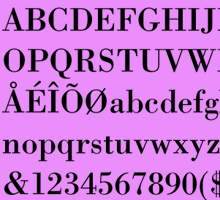
OPINIONES SOBRE LA BODONI

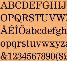
SOBRE LA NIMROD

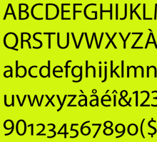
SOBRE LA MYRIAD

SOBRE LA FUTURA

LAS NUEVAS: MOD

LAS NUEVAS: NEW DEAL

LAS ODIADAS: COMIC SANS

Hacemos Tipográficamente

Nuestras categorías