1) How did you come to?
I wanted to design a self promotional poster / fixture list that people would enjoy putting up in their home/office and referring to during the World cup month - an antidote if you like to the newspaper wallcharts + pull outs - that in my opinion are functional but bar a few, look terrible and not something you want on your wall - It had to be a great poster to look at and obviously be a functional match planner/fixture list. I wanted to chronicalogically list the fixtures, rather than show all the group games listed together - basically when looking through the fixtures - I want to know who's playing that day and what time, especially for the weekend games when you can watch the games down the pub / around friends etc.
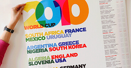
The front of the poster lists all 32 teams and Groups using the Home colours or away colours when they're white - the fixture list typography is featured down the side as a simple day to day fixture list - and because the poster is printed on A1+ paper (975 x 655mm) the type is still very large/ clear to read with space to fill in the scores - something that not obvious until you see + hold the poster.
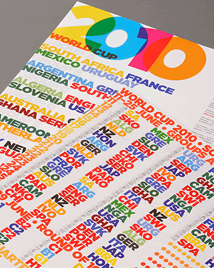
The design of reverse of the poster has provoked quite a few comments - I wanted to design/list all the group matches as large as possible - the idea being that you could be 15 feet away from the poster in the studio/office and look at the poster on say the 15th June and know at 3pm its IVO v POR - i.e Ivory Coast v Portugal 3pm kick off - you would fill in the scores on a match by match basis so although it looks busy it would I think be easy to follow - I can't deny it looks busy but once you know the system / abbreviations I think it works well?
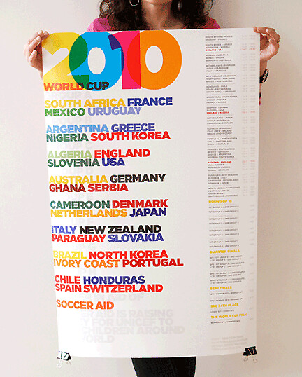
Its colourful, fun and experimental I hope people enjoy using it?.
2) How typography worked and why?
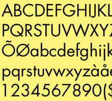
I was originally thinking of using a bold geometric face like Futura bold but loved the look of HF&J 's Gotham Black- so went with that
very pleased with the result
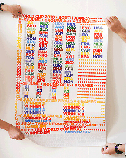
3) There is a solidarity action behind the sale of the poster?
Once the poster design took shape - I really wanted to make it happen and for the football charity, Soccer Aid to benefit from sales of the poster - I approached the best paper company in England GF Smith - - The poster is being printed on a very high quality paper called PhoeniXmotion Xenon and one of the best printers - G&B printers, each company have generously donated towards making this project happen.
(here's the soccer aid URL below - with details of how they support UNICEF)
http://www.unicef.org.uk/socceraid2010/?thesource=fb
Overall I hope people enjoy looking at it + using the poster over the world cup month
it's been really hard work promoting it but the main aim is to raise a lot of money for UNICEF


