Lo más buscado en Visualmente::El Norbi en Domestika::Book::Stan Lee, De la A a la Z::Book::Infocomics en italiano::News::El viejo disfraz del nuevo Wolverine::News::El nuevo logo de Superman::News::Entrevista exclusiva con el padre de Deadpool::::Las ilustraciones de El Norbi::Bender Rodríguez::Keith Haring::Astroboy::Batman Black and White::Patone y Perrone::Betty Boop::Mickey Mouse::Spider-Jam::Nuestros Queridos Blogs Asociados::El Norbi::QR Love::Visualmente::Infocomics::BarVisual::Tipográficamente::Universitariamente::Visualmente-Edu::Vía Libre::Bar Uch::Que Bien Que La Estamos Pasando::Los que escribieron en Visualmente, alguna vez::Carlos Gámez Kindelán::Rodrigo Sánchez::Jordi Catalá::Mario Tascón::Jaume Serra::Samuel Granados::Dolores Pujol::Fabio Marra::Luiz Adolfo::Leo Tavejnhansky::Massimo Gentile::Pablo Corral::Angel Casaña::Pedro Pérez Cuadrado::Tomás Ondarra::Kohji Shiiki::Elio Leturia::Rodrigo Fino::Ramiro Alonso::Sergio Fernández::Algunos de los archivos de Visualmente (2005-2013)::Coca-Cola::QR Code Portrait::Vía Libre::Ave María Latina::Odios Tipográficos::Infofreak::Helvética Love::Especial Cooper Black::Creatividad::Caricaturas::Cuartas Jornadas::Cumbre Mundial::Diarios online::Diálogos Visuales::100 Mejores Frases del 2005 (1)::100 Mejores Frases del 2005 (2)::100 Mejores Frases del 2005 (3)::100 Mejores Frases del 2005 (4)::
Nuestras tipografías::Mobype::QR Gothic::Stypenova::Sponge Type::Astroboy Type::Hotel Gonzo::ElectroType::Totoro::Meteoro::Mazinger::Pink Panther Type::

12.8.09

Jeff Knowles por la Knockout


1) Do you use frequently? (Why?)
Gotham. Its a great work horse, it has a good selection of weights, so it is very versatile for the likes of corporate identities. It can be softly spoken when used subtly, but can also shout about things when the heavier weights are employed.

2) Prefer? (Why?)
I like a lot of the typefaces from Hoefler & Frere-Jones, the typefaces have been created with great craftsmanship, but can be used in many contexts. I like Knockout, some weights look really simple and slick, other weights have mad personalities, but you can use any two weights together and they will always complement each other. I also like Archer, Ziggurat and Hoefler Type. Outside of Hoefler & Frere-Jones, I line Bryant and Omnes for rounded typeface, and for alternatives to Helvetica, I like Benton, Proxima Nova and Foundry Context.

3) You hate? (Why?)
Gotham, its too easy too fall back on, not the fault of the typeface, its great. More my own fault, its a frustration of always thinking I should really try something else, but Gotham always looks great, so its like an addition, but I must have better will power! (Tipógrafo inglés)

Polaroids visuales

las nuevas: ren & stimpy

las nuevas: anna

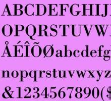
OPINIONES SOBRE LA BODONI

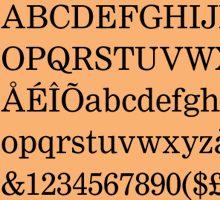
SOBRE LA NIMROD

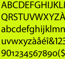
SOBRE LA MYRIAD

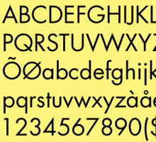
SOBRE LA FUTURA

LAS NUEVAS: MOD

LAS NUEVAS: NEW DEAL

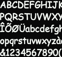
LAS ODIADAS: COMIC SANS

Hacemos Tipográficamente

ARCHIVO TIPOGRÁFICOS

Nuestras categorías