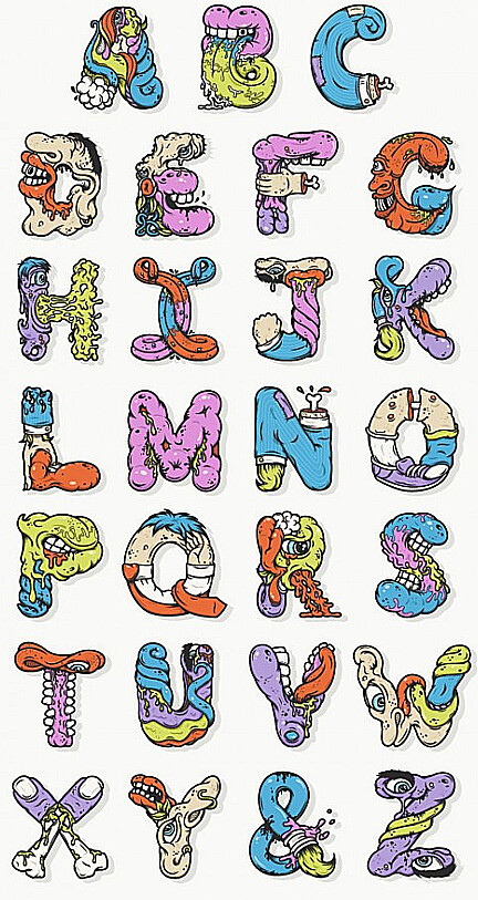
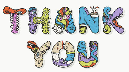
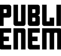
Él no es un tipógrafo consagrado. Pero el norteamericano Nathan Walker ha saltado a la popularidad por inventar una tipografía basada en la estética bizarra de las series animadas Ren & Stimpy y Aaahh! Real Monsters.
Desde su estudio All The Pretty Colors, con base en Austin, Texas, Walker nos cuenta cómo se le ocurrió crear la Alphabetcha y armar una letra N con una pierna que deja ver la punta del femur.
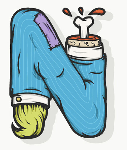
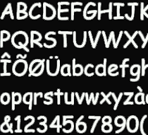
1. How did you come to a font where the letter N is transformed into a broken leg bone showing?
The alphabet came about while sitting in a medical school library with my girlfriend while she studied. I had always wanted to create the alphabet in what I consider my style, and I needed to do something to pass the time, so I just started sketching. The sort of drippy mouths, tongues and body parts tend to come naturally when I'm sketching, so it was just a matter of shaping that into letters.
2. How long did it take to complete the alphabet and the letter which was more complex to achieve?
I worked on the alphabet whenever I had free time in between my full time job and freelance projects. Overall, it spanned over 4 months of slowly chipping away at each letter. There wasn't necessarily one letter more complex to work on than others, but for some reason I kept putting off working on the letter F. It just didn't feel like a fun letter to think about, so I just skipped over it until I was ready.
3. How did the process work? First did pencil drawings and then you went to Illustrator?
All my vector illustrations start off as rather loose sketches with a pencil and paper. I sketched A through M first, minus F, then scanned it to my computer. I took that into illustrator and started to outline the shapes and give it some color. Whenever I would get tired of working on the computer, I would get the sketchbook out and start illustrating the second half of the alphabet. It definitely helped to break the project up so I wasn't staring at the computer all the time.
4. What inspired you most of the animated series Ren & Stimpy?
I was really inspired by the shapes and roundness of the characters. It all seemed rather soft and mushy. I think that helped to enhance the gross feeling the show exuded.

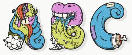
5. What is the letter did you like drawing? Why?
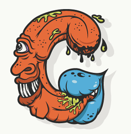
Letters B and G are probably my favorite. I like the level of creativity in them and they easily came together when I put the pencil to the paper. Plus, it's always fun to draw mouths and tongues. The ampersand is another good one. I'm working on creating a series of different ampersands in my free time. It's just a matter of finding the time!


+15.06.00.png)