Lo más buscado en Visualmente::El Norbi en Domestika::Book::Stan Lee, De la A a la Z::Book::Infocomics en italiano::News::El viejo disfraz del nuevo Wolverine::News::El nuevo logo de Superman::News::Entrevista exclusiva con el padre de Deadpool::::Las ilustraciones de El Norbi::Bender Rodríguez::Keith Haring::Astroboy::Batman Black and White::Patone y Perrone::Betty Boop::Mickey Mouse::Spider-Jam::Nuestros Queridos Blogs Asociados::El Norbi::QR Love::Visualmente::Infocomics::BarVisual::Tipográficamente::Universitariamente::Visualmente-Edu::Vía Libre::Bar Uch::Que Bien Que La Estamos Pasando::Los que escribieron en Visualmente, alguna vez::Carlos Gámez Kindelán::Rodrigo Sánchez::Jordi Catalá::Mario Tascón::Jaume Serra::Samuel Granados::Dolores Pujol::Fabio Marra::Luiz Adolfo::Leo Tavejnhansky::Massimo Gentile::Pablo Corral::Angel Casaña::Pedro Pérez Cuadrado::Tomás Ondarra::Kohji Shiiki::Elio Leturia::Rodrigo Fino::Ramiro Alonso::Sergio Fernández::Algunos de los archivos de Visualmente (2005-2013)::Coca-Cola::QR Code Portrait::Vía Libre::Ave María Latina::Odios Tipográficos::Infofreak::Helvética Love::Especial Cooper Black::Creatividad::Caricaturas::Cuartas Jornadas::Cumbre Mundial::Diarios online::Diálogos Visuales::100 Mejores Frases del 2005 (1)::100 Mejores Frases del 2005 (2)::100 Mejores Frases del 2005 (3)::100 Mejores Frases del 2005 (4)::
Nuestras tipografías::Mobype::QR Gothic::Stypenova::Sponge Type::Astroboy Type::Hotel Gonzo::ElectroType::Totoro::Meteoro::Mazinger::Pink Panther Type::
Mostrando entradas con la etiqueta Neutra Face. Mostrar todas las entradas

15.4.10

Jan Schwochow por la Sabon

JAN
1) Do you use frequently? (Why?)
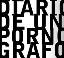
I often use the NEUTRA FACE - I like the style of the twenties: http://www.houseind.com/fonts/
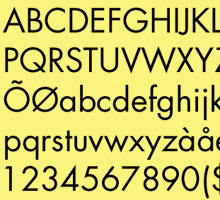
The grotesk font have all styles you need! So this is typeface is our house font: http://www.golden-section-graphics.com/

Because many customers want a font that they can edit by themselves
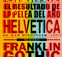
we often use Helvetica, Arial or Myriad.

2) prefer? (Why?)
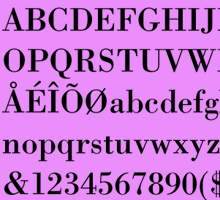
As an antiqua font I like the "SABON" for normal text.
In my opinion it is one of the best fonts for body text.

3) You hate? (Why?)
I don't hate fonts in general.
It belongs to the function when you use a font!

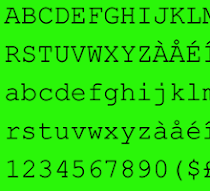
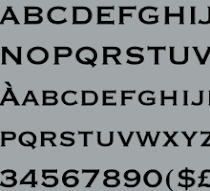
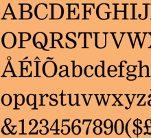
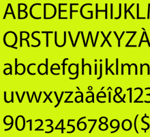
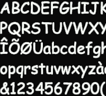
I only dislike some grotesk fonts because their numbers
are not monotype and that is not good for tables or infographics.(Infógrafo alemán)

Polaroids visuales

las nuevas: ren & stimpy

las nuevas: anna

OPINIONES SOBRE LA BODONI

SOBRE LA NIMROD

SOBRE LA MYRIAD

SOBRE LA FUTURA

LAS NUEVAS: MOD

LAS NUEVAS: NEW DEAL

LAS ODIADAS: COMIC SANS

Hacemos Tipográficamente

Nuestras categorías